Modular UI - A Way Forward for Storyboards
Along with all of the other goodies this WWDC, Apple has added a few great features to storyboards. Things like custom fonts, @IBInspectable and @IBDesignable, and size classes ease a lot of the pain in working with Interface Builder.
Even with these changes, there are still a lot of problems and pain points in creating your UI with storyboards, and I’d like to propose solutions for how to fix them. Let’s start with the problems.
Problems #
1. Clutter #
I’ve come up with a new brilliant app for a pig social network that I call Snoutbook. Snoutbook lets you take photos of your porcine pet and send them to your farmer friends! Let’s start with the photo screen.

Okay, the PhotoViewController is looking pretty good, but having a photo app without filters these days is borderline illegal. Let’s add a drawer of effects at the bottom.

That covers up the footer a bit, but that’s not a huge problem. The last thing we need is a tour. I mean lets be honest, pig farmers aren’t the best with new technologies. We’ll show them a series of messages to help them along.

My PhotoViewController is complete, but extremely unwieldy. Finding and editing anything on this screen would be a huge pain, and who knows what I might add to this screen in the future! Sure, I could have done the tour programmatically, but placing all those tour bubbles would be a huge pain.
2. Reusability #
This is 2014, and photos just aren’t enough. I want snorts and movement! This app needs video! Let’s start creating a VideoViewController like our PhotoViewController.

Looking good, but you know what it could use? Filters! Let’s allow the possibility of Sepia pigs with the same filters drawer from my PhotoViewController.

Well this isn’t good. I have two copies of the same thing in my storyboard!
If I want to change something, I’d need to do it twice. That’s not very DRY at all!
Solution #
De-clutter #
What if there was a way to de-clutter the views while still keeping them functionally the same, and what if you could use the same technique to reuse views across storyboards? Let’s create the concept of a placeholder view. What if I could do this:
The placeholder view wouldn’t be an actual object, just a representation of the layout constraints and position of my filter drawer. Since it’s still a subview of my view controller, I could still connect IBOutlets to my filter drawer as necessary.
To avoid the clutter of having to click down into objects underneath the placeholder view, placeholders would only allow interaction by either double clicking on it in the IB Dock, or double clicking on the view the placeholder view represents. You would only interact with it when you have to.
Reusability #
Well, great! But how does this solve the reusability problem? By allowing our placeholder view to represent a nib.

Now instead of copy-pasting my filter drawer, I can just have a placeholder view on both my PhotoViewController and my VideoViewController that represent the same nib. You would be able to see the contents of the nib straight from the storyboard, but would not be able to edit it’s subviews. Each view controller will still be able to separately connect it’s outlets to the different instances of the nib. Note that you can still resize the placeholder view and it will resize the outermost frame of the nib. The inner contents of the nib will re-arrange themselves based on their layout constraints.
Hopefully by now you’ve understood the idea of placeholders and can agree that they’re a pretty good idea. Now that I have you, I’m going to throw you a curveball. Placeholder views themselves are not actually what I want. Here’s my real proposal.
What a Twist! #
My real proposal #
In a sentence, I think that storyboards should contain nothing but placeholder views. Allow me to explain.
Right now the distinction between nibs and storyboards are muddled. They share a ton of the same functionality, while at the same time having somewhat arbitrary distinctions. For example, I can create the layout for a view that has no view controller inside a nib, but not inside a storyboard. In a storyboard, I can create a static table view but there’s no way to do it inside a nib. They coexist in a very strange, overlapping way.
What I propose is to separate their concerns entirely. A nib should be an editable view or view controller, and a storyboard should consist of nothing but nibs and connections between those nibs. Here would be the new responsibilities of each.
Nibs #
A nib would continue to represent a single view or view controller and it’s associated objects. Only inside of the nib file are those objects editable. You can change their layout constraints, positions, background colors, fonts, and everything else associated with subviews inside of that nib.
While a nib would have no awareness of anything outside of it’s subviews, a nib would be able to have sub-nibs (similar to the placeholder view above). For example, a table view nib could have a sub-nib that is a table view cell.
To fix the clutter problem listed above, sub-nibs would come in two varieties, “in place” (they would appear in the frame they will have in their superview) and “remote” (Like the second to last image above - connected by an arrow) to help the clutter problem.
Storyboards #
A storyboard would be a collection of uneditable nibs, and it’s only job would be to define the interactions between them. They would define the segues between view controllers, and trigger properties that nibs would expose using @IBInspectable. “Remote” sub-nibs would appear in place to simplify the display of view controller. To see the contents of a nib, you would be able to command-click it like you do in code to see the contents of a class.
Let’s take a look #
(Note: I did this all with the current IB, so sometimes things are storyboards when they’re meant to represent nibs.)
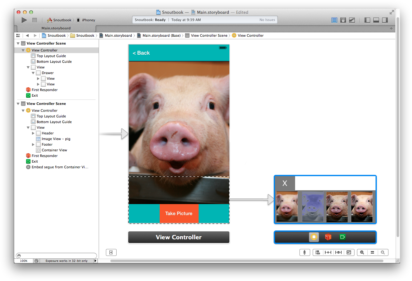
Let’s remake our PhotoViewController and VideoViewController in Snoutbook. Now I’ve broken out the FilterDrawerView into it’s own nib as FilterDrawerView.xib.

Here’s my PhotoViewController.xib. Note that the placeholder view on the right is a subnib, FilterDrawerView.xib. On the left is a placeholder that’s just pointing to a view. By not being on top of my view controller, it’s much more clear what’s going on.

Finally, here’s my storyboard. It has my two nibs, PhotoViewController.xib and VideoViewController.xib, and defines that when I hit the back button, it should go back to PhotoViewController.xib.

Benefits #
Let’s take a look at all the benefits this setup would give us:
- Clear separation of concerns between nibs and storyboards.
- Reusability of UI that is created inside of IB.
- Easier version control. Most changes would take place in a single nib instead of a massive storyboard.
- Easier to share UI components with others. Right now it’s downright impossible to share controls with others because the only way to use them would be to copy and paste them into your storyboard. If all your controls were nibs, you could share them in between projects.
- You still get a live preview of what your app will look like inside the storyboard, and with connected placeholders you get a much more readable and understandable view of your project.
- This will be especially helped by @IBInspectable. The storyboards can set flavors of the nib differently in different places.
Negatives #
It’s not without negatives, there are still some problems to deal with:
- The storyboards would be slower to load because they would have to recursively load all nib files they contain.
- It would be harder to understand for newcomers why they can’t edit text in storyboards.
- It probably can’t be reverse compatible.
- They still don’t fix UI subclassing.
Conclusion #
Regardless of whether you think people should implement all layout in code, storyboards can and should be improved. They allow for faster iteration, and make it dramatically easier for new developers to understand your project. Currently the distinction between storyboards and nibs are muddled and unwieldy, but I think Modular UI is large step towards creating more reusable and cleaner Interface Builder.
Feel free to tweet me at @ethanjdiamond and let me know what you think.